Etruscan commemorates all aspects of South’s year
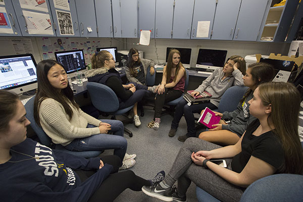
Photo courtesy of Cameron Krasucki, Etruscan Photographer
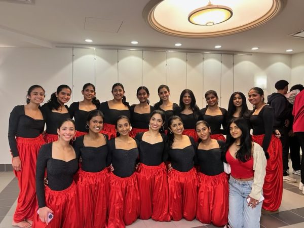
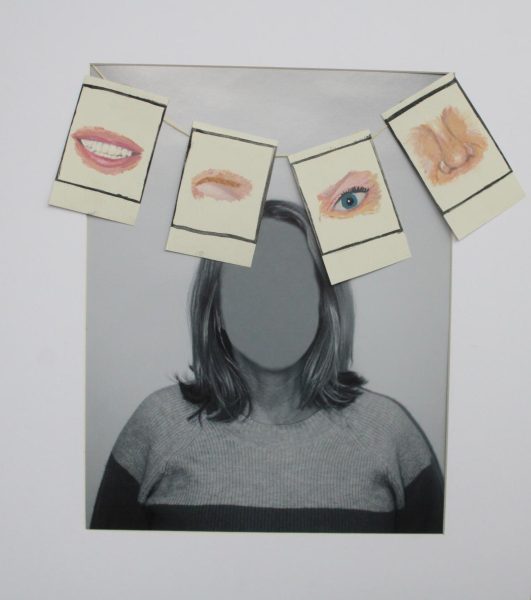
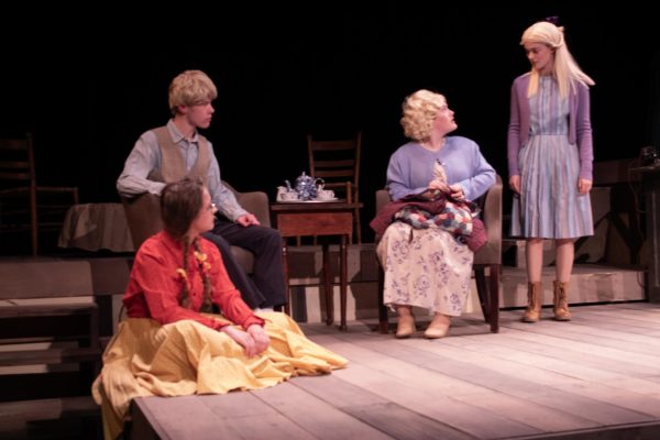
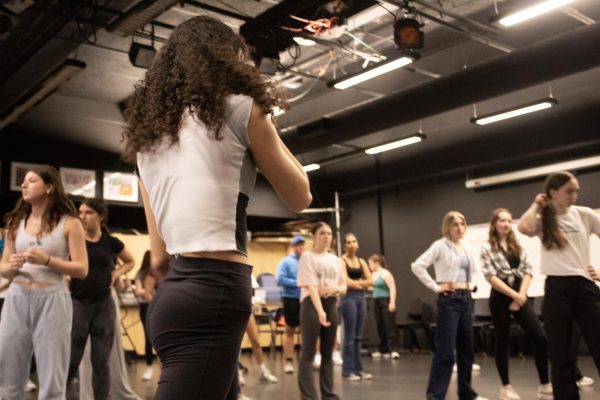
Exceptional Etruscan: Diligently working on South’s yearbook, Etruscan, the editors aim to include all features of South, taking into account recent international events and their impact on the school. This publication, themed, “Exactly Like Nothing Else,” was finalized April 27.
May 26, 2017
Swirling designs, bold headlines and unique stories burst from the glossy papers of a 500 page yearbook. South’s yearbook staff, composed of photographers, designers, writers and editors, works tirelessly to ensure each year’s book encompasses the most unique aspects of South, according to Alisha Gillani, co-editor-in-chief of the publication, Etruscan.
According to Etruscan’s adviser, Brenda Field, the staff starts considering what will be covered the summer before the book comes out. Many topics are taken into consideration in order to provide a quality work at the end of the year.
“We talked about what might be different about the school year, but also what might be different about the world in general, and I think [the staff] sensed that this year would be different,” Field said. “2016-2017 would be a different kind of year with the election and the Olympics, for example. There were things that were happening this coming year that were different, and so they tried to touch on […] current event issues in this book more so than in some previous books.”
According to Julia Nakashima, co-editor-in-chief, the theme of this year’s yearbook, “Exactly Like Nothing Else,” had a lot of inspiration from outside of the South community. They looked for connections between the city and what GBS means to them.
“In the summer all of the editors come together and we go to Chicago and we try to think of our theme,” Nakashima said. “So then we thought about what GBS means to us. This year we thought [South] was authentic and [that it was a place] where everybody could come together and be diverse. We thought that [South] was exactly like nothing else.”
Gillani believes the coverage of this year’s yearbook is unique as it addresses many world issues as well as things specific to South. Gillani says she finds the yearbook can commemorate occasions important to individual groups or clubs which others may have found insignificant.
“I think [having a yearbook is] especially important [to have in] a big school like this where there is no way to know what is going on everywhere,” Gillani said. “[The yearbook] gives you a way to show the school all [that] is going on and [that it] is something that’s important. [To say this] should be happening [and] we should acknowledge [it] throughout the entire school.”
Similarly, Nikki Gillani, senior photography editor says she finds the book’s documentation important for both those involved as well as those who did not attend the events featured.
“[Those] moments are documented in our book and [students] can look back on them […],” Nikki said. “[The yearbook] can bring people back to a moment that they loved or put people into a moment that they missed.”
Nikki says that as an editor, she finds it hard to balance constructive criticism and praise when working with staff photographers. She added that most of the photographers had been new to the yearbook this year.
“[I try to] let them know, ‘you’re not doing anything wrong, but you can do something better by doing this,’” Nikki said. “[It is] kind of like being a teacher to them, […] and it’s hard to balance the critiques from the reinforcement.”
Design Editor Kaya Dlouchy believes the visual aspects of the page are crucial to the overall success of the book. Dlouchy says that each page needs to be pleasing on an aesthetic level in order to grab the reader’s attention.
“Even if the words in a story are too close together, it just looks like a block of words and it looks like it’s too much to read, but if you put a little space in between [the lines] then it looks a lot easier to read,” Dlouchy said. “Everything matters, so if you make it look nice it looks more presentable, and people want to read it more. [People are] more intrigued by something if the design is nice.”


